Thanks for all your feedback on the new blog layout.
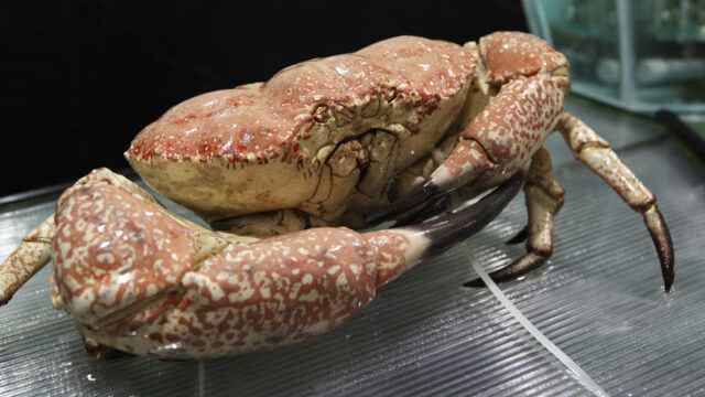
A lot of people have said that the banner was too plain, so now I have included a Crab in the banner. Hopefully it has more character now.
I have also tried to spruce up the Food Directory by changing the highlight colour to orange and changing “Select a Label” to “Find Something to Eat”. I still not really like it, so if you have any other suggestions please let me know.
I hope you all find the “Join the community” bar which links to our facebook, twitter, forum and RSS feeds account useful.
If there are any other features you would like to see, please let me know.


