 Been fiddling around with the new layout.
Putting the posts on the left makes sense for those who serve using the Blackberry.
Made all the colours more subdued.
So what do you think?
UPDATE 1
Thanks for all your comments.
Have done the following:
- Added a margin to the left side
- Increased the size of the font by 10%
Do you all still like the pics to be in the middle instead?
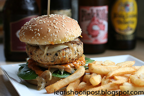
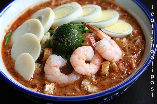
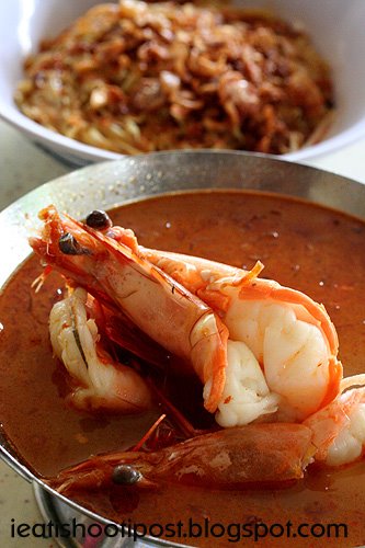
How about the size of the pics – should I make them bigger? Like this?

The picture of the food on the banner on top- any comments
Overall, I have changed the most of the orange colour words to grey, also added a highlight to the titles on the sidebar.
Also changed to look of Google Ads and MyBloglog to reflect the more subdued colour scheme. Essentially, to make the rest of the blog less colourful so as to minimise distraction.
Last year there was a big debate as to whether the background colour should be black or white. I still think black is more distinctive as most of the other food blogs are white, although I notice that there have been more black food blogs since last year.